New Microsoft Site Bombs
More often than not, the more money you have to spend on a design, the more designers get pulled onto the job and the better the look and feel is of the finished product. That’s just the way things are. So when I tell you Microsoft have just released their latest site, you should be thinking that they could probably afford to blow a few million on their latest design. This site is the hub point to all their sub-sites. If someone wants to investigate a new Microsoft product, they will go through that site.
In my opinion, the new site looks like a 20 minute session with a vector imaging program and someone that has no idea how you should lay things out well. If you don’t want to visit their site, here’s a round up for you. I should say now that while I took the screenshots, logos and trademarks depicted within are that of Microsoft Corp.

At a glance, it all looks quite pleasant. The gradients are nice and so they should be when there are 203k’s worth of images on the page. That’s not too bad but some would say you need to aim a lot lower.
As has always been the case, there is a royal mess of in-line javascript in the page source, without much to show for it on the page. All that code could have easily been tidied away into a .js file which could have been compressed, saving the user time to download the page. There is one thing that you can see with JS, namely the menu (shown above). The real question is: WHY?! Here is what you see when you hide the menu:

What is the point in that? Nothing. That’s a massive waste of coding, bandwidth and page space. I shall then, if I may, draw your eyes further down the page and again, we see more wasted space:

I know some of Microsoft’s previous designs could have been accused for being space-misers but going to this extreme is a complete, unmitigated mistake. By having a design that’s starting like this, as they try to add more and more to the page, the layout will crumble (more than it already is) into something that is barely usable. You then have to factor in how much extra bandwidth it’s going to cost to fill the page out. How much extra code. For the data and graphics on the page, they’re already running 200% over a decent standards design. For the record, at the time of writing there are 5 validation errors, ranging from slightly mad to insane. When will Microsoft learn?
I’m not here to join the mob of people demanding Microsoft start using standards, I’m here to assess their attempt at design so here is what I would have done with the current design, if I was finishing the work:
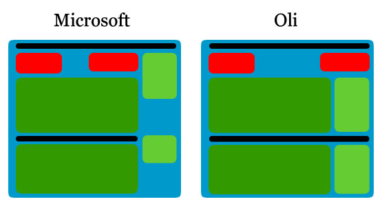
If I had to keep all the data, that’s how I would do it. Keep things aligned horizontally, stop putting in crazy javascript for no reason and generally put things in a place for a reason. behind the scenes, mine would be a lot cleaner on the JS front completely.
I can see people getting fired over this sort of design fiasco.
There are more technical problems along the way too. Take a look what happens when you disable javascript:

Javascript should ALWAYS degrade gracefully. This just breaks.
What’s worse, Microsoft have tried to blame this sort of pishy design on their users. Taken from “About the new Microsoft.com home page”:
Q: Why did you move the main navigation menu from the left side of the page to the right?
A: Customers told us it was too hard to find what they were looking for on the home page.
Seriously, guys…
So for my final verdict… **drum roll**
2/10
No marks given for technical completion. No marks for compatibility as almost everything “requires” javascript. No marks for document efficiency or download size. No marks for clear or effective navigation. 2 marks for visual appeal.