CSS layouts are so much better than they used to be
I’ve been doing this web thing a while, and in finally dropping IE11 support for my last few projects, I’ve been able to use raw CSS —not somebody else’s framework— and it’s been lovely to see how far CSS has come.

You whipper-snappers might not appreciate it but CSS used to be pretty janky. You could style some of your content, but getting it into the right places, in a reproducible way was a headache. It was so inconsistent between browsers, and so incompatible with the designs we were paid to implement, we’d use ghastly devices like image <map>, <frameset> and nested <table> elements. We’ve come a long way since then.

The Holy Grail was A List Apart’s famous article, a culmination of years of forebears delicately floating things around, abusing padding and negative margins to achieve something it took a <table> to do before. It’s hard to appreciate 16 years on, but that article was my bible for a while.
As CSS standards improve and old versions of IE died off we saw the rise of CSS Frameworks, third party code, pre-hacked for edge-cases, just follow their markup, use their classes and everything would work. Most of the time. I’ve been through a few: Blueprint, 960, Bootstrap and most recently Tailwind.
And I hate them all. That’s not fair. They’ve helped me, professionally, cope with an increasing number of browsers, and increasingly complex layouts (waves in responsive), and they’ve definitely got better —depending on your opinion on utility-first classes— but they all reset to something slightly different, and while the form classes are genuinely helpful, and they all served a purpose for layout, I’d rather have not depended on any of them. It’s those moments where you notice that somebody decided that display: table was the best option to meet IE10 support. And until PurgeCSS came along, they also meant a serious hit to the page weight.
But it’s 2022 now and I’m able to drop IE11 support in most new projects. I can drop all this other crap too. I’m naked again, writing real, raw, standards-abiding CSS without having to look up a billion utility classes, not having to inspect everything. I can just write layouts —my way— and concisely throw things onto the page.
I’m sure I’ll still use frameworks for complex components. Forms are a great example of something that starts off very easy and by the time you’re implementing a <fieldset> style and are trying to plug in your error feedback messages, you wish you’d never started. The standards have some way to go there.
Holy Grail '22 — Layout doesn’t have to be hard.
Let’s start with the HTML.
<body>
  <header>...</header>
  <nav>...</nav>
  <main>...</main>
  <aside>...</aside>
  <footer>...</footer>
</body>
The original example 3 (view source if you dare) needed wrappers and hacks. Our modern markup can mean something. We can ditch the flabby wrapper containers. We can even re-order the elements so they make sense to screen readers and other scrapers.
And our CSS just paints those items into a 3×3 grid via grid-template-areas while the grid-template-* rules handle the sizing. There are so many different ways to handle this with display: grid but I like this one.
html{ height: 100% }
body {
  min-height: 100%;
  display: grid;
  grid-template-columns: 180px 1fr 130px;
  grid-template-rows: min-content 1fr min-content;
  grid-template-areas:
    "header header header"
    "left center right"
    "footer footer footer";
}
body > header { grid-area: header; }
body > nav { grid-area: left; }
main { grid-area: center; }
body > aside { grid-area: right; }
body > footer { grid-area: footer; }
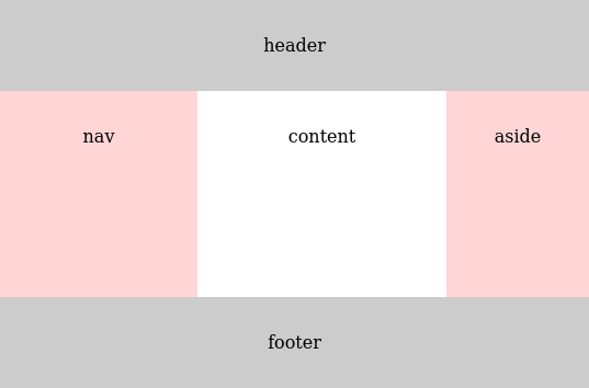
That’s 100% width, 100% height, equal height centre columns.
The Holy Grail in its entirety in 30 lines and change.
And it’s quickly adaptable. If you wanted a maximum width, like a lot of layouts (inc this one) you can just tune the grid-template-columns centre column from 1fr to a minmax width, and use justify-content to align the grid to the centre of the <body> element. I’ll add some padding to push the grid away from the edges too.
body {
  margin: 2rem;
  min-height: calc(100% - 2rem);  /* tune it to keep full height */
  grid-template-columns: 180px minmax(0, 690px) 130px;
  justify-content: center;
}
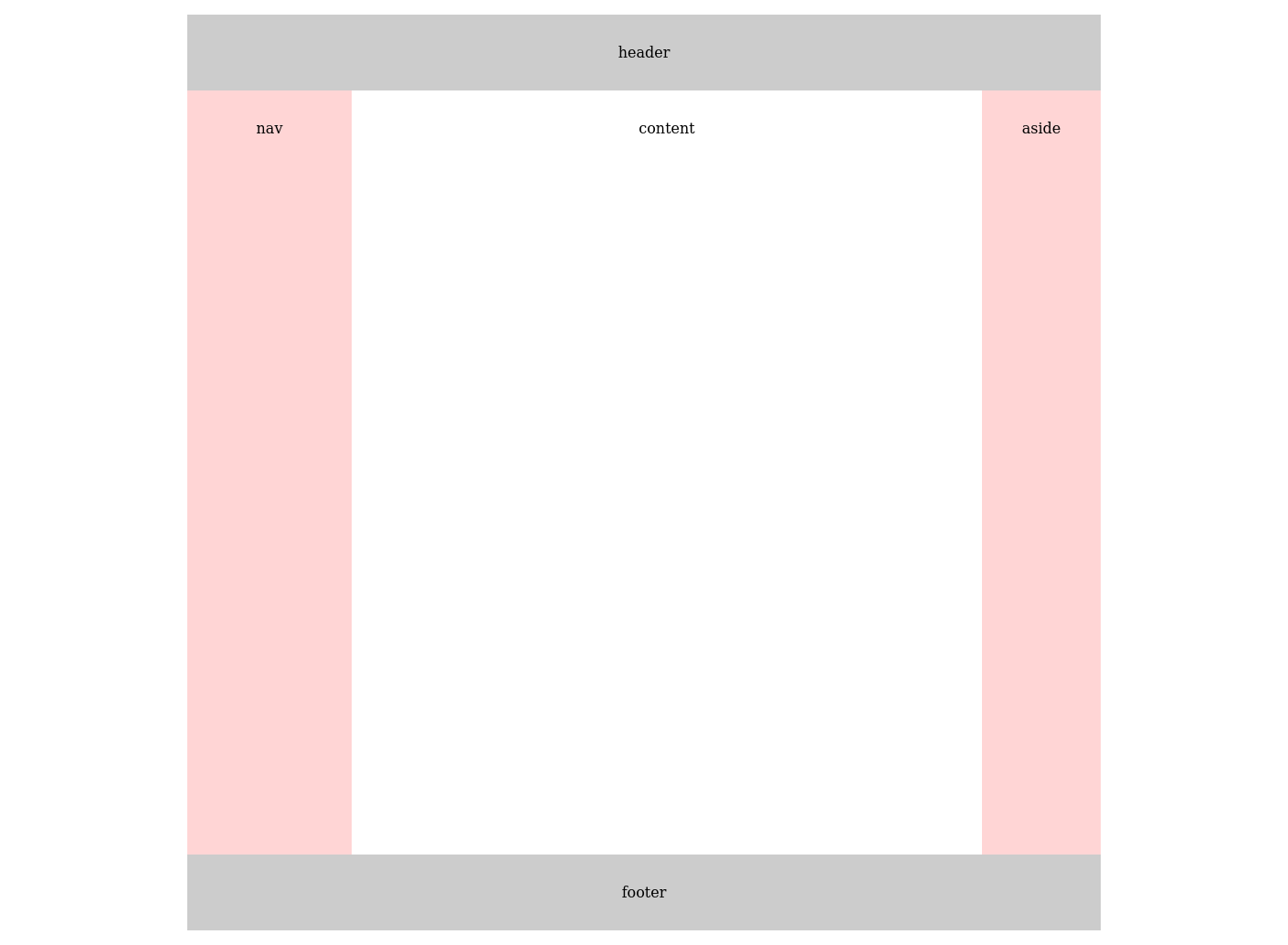
Want spacing between zone? Use gap.
Borders and padding can be baked into the sizing using box-sizing.
It’s excruciatingly simple. This is so much better.
One last time, for the years of suffering and hacking and wasted effort, screw you, IE.