Adobe: Do as we say, not as we do
Adobe launched its Open Source initiative website the other day and I took at a look at the page. After highlighting some of the text as I read through it, I quickly realised I had stumbled through a warp-hole and landed in 1995. Warning: bad coding practices in this post!
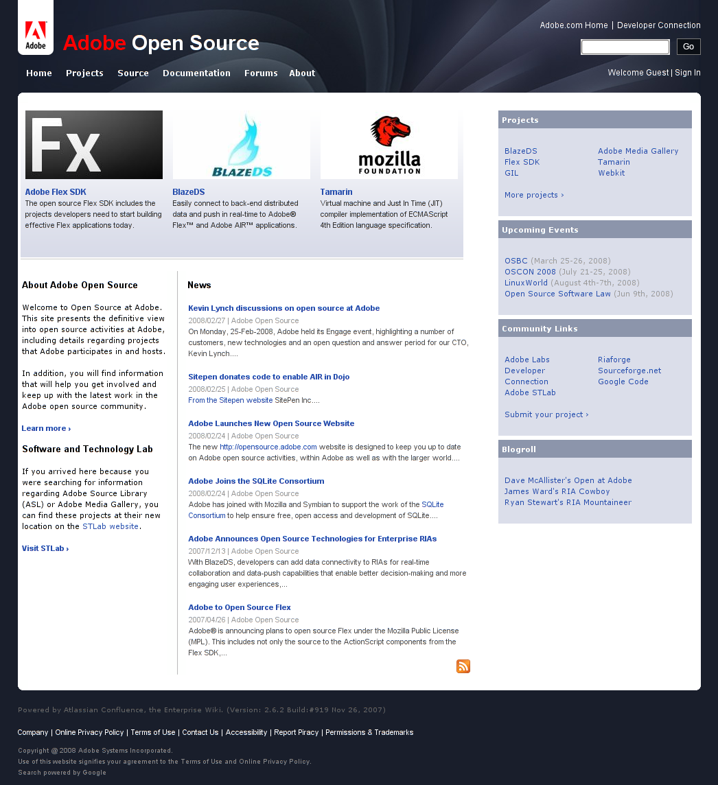
It’s been a while since I’ve picked apart a design implementation but Adobe’s Open Source site shocked me so much that I’m going to open up the floodgates on these guys. There are just so many issues and webdesign faux-pas lurking around it.
Adobe might not be the first name that jumps to mind when you think of good clean web design. They own Flash and Flex, two things I keep telling people are a clear path to the dark side. They own Dreamweaver — the tool responsible for almost as many accessibility-related woes as Microsoft’s unworldly FrontPage. But that said, they are trying to improve. Dreamweaver now ships with standards-compliant templates, has standards-checking features built in and even allows you to leverage the more accessible features out of Flash, had you chosen to implement them in your animation.
Let me be clear: this design isn’t bad — it’s actually quite pretty in places — but it’s let down by poor HTML, lacklustre CSS and gives the impression that it was coded by a chimpanzee on a hearty mixture of steroids, coffee and crack cocaine. How can I say that? Well load up their site and press Control-A. You should see something like this:
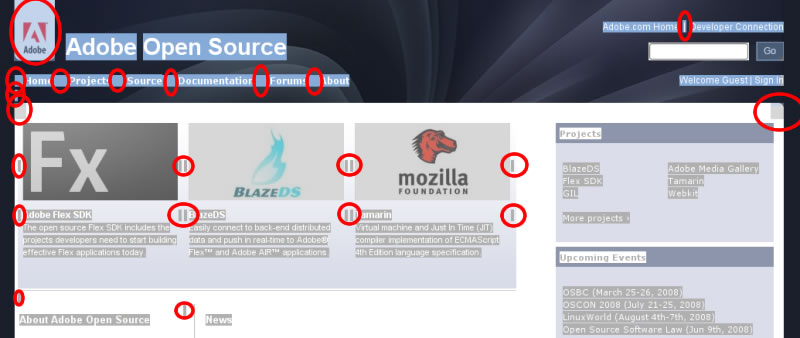
The markings are my own, to show what you should be looking for: scuzzy s, images used for design (corners and logo) and the use of | instead of a CSS border.
But these are just the immediately noticeable issues. Look what happens when we pass the site off to the validator:

But by this point, I’m not surprised. Lets have a look for <br /> tags — things that you shouldn’t need if you know the smallest bit of CSS: what a surprise 34 of them!
Oh but wait, what’s this? Oh it’s not… Christ… I think I’m going to be sick…
<table width="955" height="135" border="0" cellpadding="0" cellspacing="0">
Adobe! What went wrong? Oh god, there’s another table inside that table! Nested tables! Oh the humanity!!!
<table cellpadding="5" width="97%" cellspacing="0" bgcolor="#DBDEEA">
<tr><td bgcolor="#8C95AB"><font color="white"><b>Blogroll</b></font></td></tr>
<tr><td>
<table class="sectionMacro" border="0" cellpadding="5" cellspacing="0" width="100%">
At least there isn’t any hideous inline CSS or JavaScript, or a combination of the two? Wrong again! Take a look at this wonderful line (line:446 - please notice how the initial span is never closed)
<span class="style34">
	<a 	href="http://www.adobe.com/aboutadobe/"
		target="_blank"
		style="color: rgb(255, 255, 255);"
		onmouseover="this.style.color='#000000'"
		onmouseout="this.style.color='#FFFFFF'">
		Company
	</a>  <span class="style47">|</span>  </code></pre>
How was a site like this let through QA? Even ignoring all my nit-picking, the site doesn’t even render properly. I’ve sent Adobe an email for some sort of response and I’ll publish any reply but just let this be a lesson: pretty doesn’t mean good.