Ubuntu 10.04 is good, not perfect
Recently released, Ubuntu Lucid Lynx makes a lot of core improvements but in my eyes, falls further back in some aspects. This isn’t another review, it’s a list of what-and-why I hate parts of my favourite operating system along with some suggestions on how to make 10.10 better for everybody.
Just to reiterate, this is not a balanced or full review of Ubuntu. I am looking at what I think is wrong with Ubuntu so it’s going to be fairly negative in places, focussing on regressions, remaining imperfections and new issues. I hope there’s some value in going through this…
… but if you disagree with the sentiment or any part of the post, feel free to let me know in the comments.
Bug 532633 aka “The buttons”
A lot of water has passed under this particular bridge already. Its bug report has attracted 772 comments. If you’ve no idea what I’m talking about, a picture to save a thousand words:
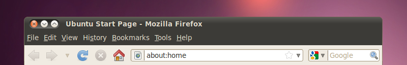
The minimize/maximise/close buttons have moved. This came mere hours before the UI freeze. Other than plain not liking it (there is some of that, I’ll freely admit) there are a few issues of consistency, process and justification:
-
Major design changes should get community review! This has had significant review now and I would say it’s a significant majority against the change, yet they’re still going with it. Who cares what the users think!
-
There’s no menu icon. This means there’s no graphical indication as to what the window is (means you have to read == slower) and you have to right click to access the window functions.
-
The controls are far too close to other interface items. Not a design issue so much but a huge usability problem. I’ve clicked close instead of the file menu but thankfully that was just firefox. If I had lost data to this, I would have been furious.
-
Everything else in Ubuntu has close buttons on the right. In fact most window gestures (scrolling, and resize corners) are on the right.
-
It’s forced on existing users without giving them the choice. Users have been able to specify that they’d like their icons like this for years but I wonder how many had chosen this before Canonical pushed the update. I would guess that it’s just the OSX-emulating folks and even then, they use a different order.
-
This is a Long Term Support release. Some people only use LTS releases meaning they’re probably going to be using this for between two and three years. Shuttleworth loves talking about cadence in Ubuntu but I don’t see it here. LTS releases aren’t the times to introduce major UI shake ups. Get things stable. Get things working in a predictable way. Don’t dick around with the window buttons.
-
Shuttleworth’s justification for this is “windicators” but they’re not coming until 10.10 at the earliest. My point is, he didn’t need to piss everybody off for another 6 months.
You can fix it. It’s not a hard fix but it’s still one extra Google users have to do to get their system back the way they want it:
gconftool-2 --set /apps/metacity/general/button_layout \
 --type string "menu:minimize,maximize,close"
Indicator Applet
The Indicator Applet --IA herein-- is something Canonical are phasing in as a compliment/replacement for Gnome’s Notification area. It currently handles a few functions functions: controlling volume, a battery monitor, bluetooth and handling all messaging services (Evolution, Gwibber, Pidgin, Empathy). There’s also a plugin for Banshee (and there may be others) to let it lurk under its own IA icon.
It even looks better. Notification Area doesn’t do spacing very well and an old bug is there so if you have a transparent panel, some tray icons have ugly opaque backgrounds but everything inside IA is nicely presented.
Not everything is presentation. Just by clustering the messaging services like IA does, it’s twice as hard to get to something in there.
Other functionality gets stripped out too. Where are tooltips? The old volume control used to tell you the current volume but the IA version is completely silent. Same with the battery monitor, you have to click to see the remaining time. While I’m beating on the volume control, whatever happened to double-middle-click for mute? That was handy if you knew it.
There’s also a general design regression in that now all the out-the-box notifications and tray icons are monochrome. This is by design but plenty of the all the other icons that have (xchat, liferea, deluge, update manager and the cpufreq applet) don’t have theme icons.
That and the old Notification Area doesn’t know how to space things. Nothing else is really presentation-aware. If Canonical want to make things look right, they need to change how the whole panel works. If they want monochrome, fork the panel and give it display control to render everything in monochrome. If they want icon spacing higher than Notification Area, replace it and give apps a NA-style interface to transparently hook into and handle those icons.
If Canonical want to make it work well, they’ve got to investigate a few things. Firstly, access to deep items and tooltips. Nothing about the new system should be harder than the old one. If you’re going to nest chat applications, perhaps clicking isn’t the right thing. Perhaps all the IA menus should open up on hover so you can quickly see statuses. Or bring back tooltips.
Vanishing icons!
What happened to the icons in window menus, context menus and action buttons?
Right click on something in one of the later Ubuntu releases and you’ll rarely see any icons in window or context menus. You will see a few but you’ll usually just see a icon-sized space. A lesser noticed omission is icons on common action buttons like Okay, Cancel, Help, Close.
This is classic “I want a clean interface” decision that happened with little regard for usability. These icons help people make choices. It’s like colour coding things green and red to indicate forward or backward progress. You subconsciously know what they mean, remove the icon and you have to read the buttons, slowing interaction and increasing error rates.
You used to be able to fix this through the Interface tab in Appearance Preferences but thanks to some upstream meddling, that pane has now gone. However you can still fix it through gconf with two quick commands:
gconftool-2 --set /desktop/gnome/interface/menus_has_icons \
--type bool true
gconftool-2 --set /desktop/gnome/interface/buttons_have_icons \
--type bool true
Update notification
A couple of releases ago, somebody thought it would be great to make the Update Manager window just pop behind things when it detected available updates rather than spawning a bright orange Notification Area icon. So taking a very obvious feature and turning it into a window that might never be seen.
Simple enough to revert but urgh… Why does it take so much effort to have a simple, predictable system?
gconftool -s --type bool /apps/update-notifier/auto_launch false
Finding new apps is harder
The Ubuntu Software Centre was bought in as a speedier, more direct replacement for the old Add/Remove Applications tool. While it is a lot faster to load and search, it’s a lot slower when all you want to do is browse and find new things.
This is because the old tool allowed you to browse by popularity and the new one doesn’t. I often went into the Games section and had a look around to see what other people were using.
I’m not sure how simple this is to fix but I’d imagine it’s little more than a case of adding back popularity, sticking a star widget in there and giving it a simple sorting algorithm.
Is this just me?
Am I the only person that uses Ubuntu like this? Am I the only one that cares about being disrupted every time the design team and Mark Shuttleworth rip another chunk of functionality out of Gnome in the guise of better design?
Well there are certainly a lot of complaints littered around various bug reports but there seem to be equal reviews from the usual suspects crooning on about how pretty something looks, paying little attention to how people might actually use it.
We’re getting to the point where people are making “fix it” scripts to put everything back to how it should be. I think it’s a little sad because people shouldn’t have to do that for a usable system and the people that “just use” Ubuntu probably won’t find out about it.
Mark, when you’re considering overhauling something like panels or windows (something every person uses every day), please have the manners to ask a few users if it negatively effects them before you ram it through. I personally don’t think design-by-dictator is working for us and you might have fewer people cursing your name if they can see it was genuinely done for the greater good with evidence to back it up…